Python visualization | Seaborn Economist classic chart imitation
The previous original tweet used R-ggplot2 to implement the Economist’s classic chart imitation R-ggplot2 Classic Economist chart imitation, so in this issue, we will use Python-seaborn to implement this classic The Economist chart reappears. The main knowledge points involved are as follows:
- Python-seaborn regplot regression linear fitting graph drawing
- Customized drawing of matplotlib drawing legend
- adjustText library implements text avoidance addition
Python-seaborn draws a fitted line graph
First, we preview the data (partial):
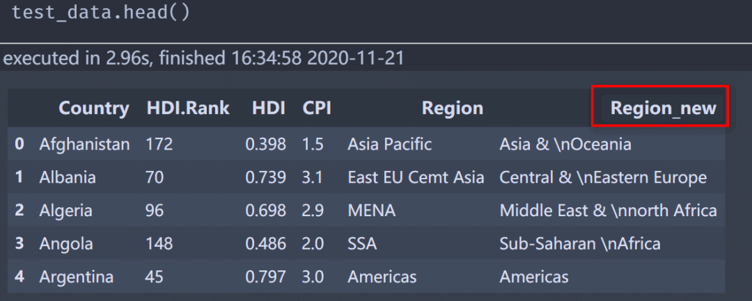
The Region_new column is a new column changed according to related requirements, and the drawing is also based on secondary data.
Using seaborn to draw the fitting line can avoid repeating the wheel by yourself. Next, we will directly draw the most basic (without any modification), the code is as follows:
fig,ax = plt.subplots(figsize=(8,4.5),dpi=200,facecolor='white',edgecolor='white')
ax.set_facecolor("white")
fit_line = sns.regplot(data=test_data,x="CPI",y="HDI",logx=True,ax=ax)

ax.text(.85,-.07,'\nVisualization by DataCharm',transform = ax.transAxes,
  ha='center', va='center',fontsize =8,color='black')
The visualization effect is as follows:
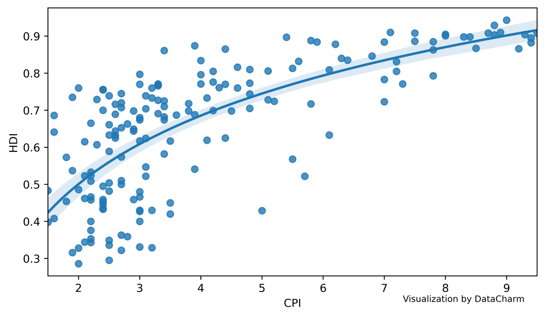
The main parameters required here are as follows:
- logx: used to draw a logarithmic fitting curve, the default is False, that is, a linear fitting line is drawn.
- ci: the confidence interval for drawing the fitted curve, which can be an integer (0~100), or it can be set to False, that is, no confidence interval is drawn.
- { scatter,line}_kws: dictionary type, you can customize the drawing attributes of points and lines, including color, size, thickness, etc.
Currently only these are introduced (because drawing is required), for more details, please refer to the corresponding official website: seaborn.regplot
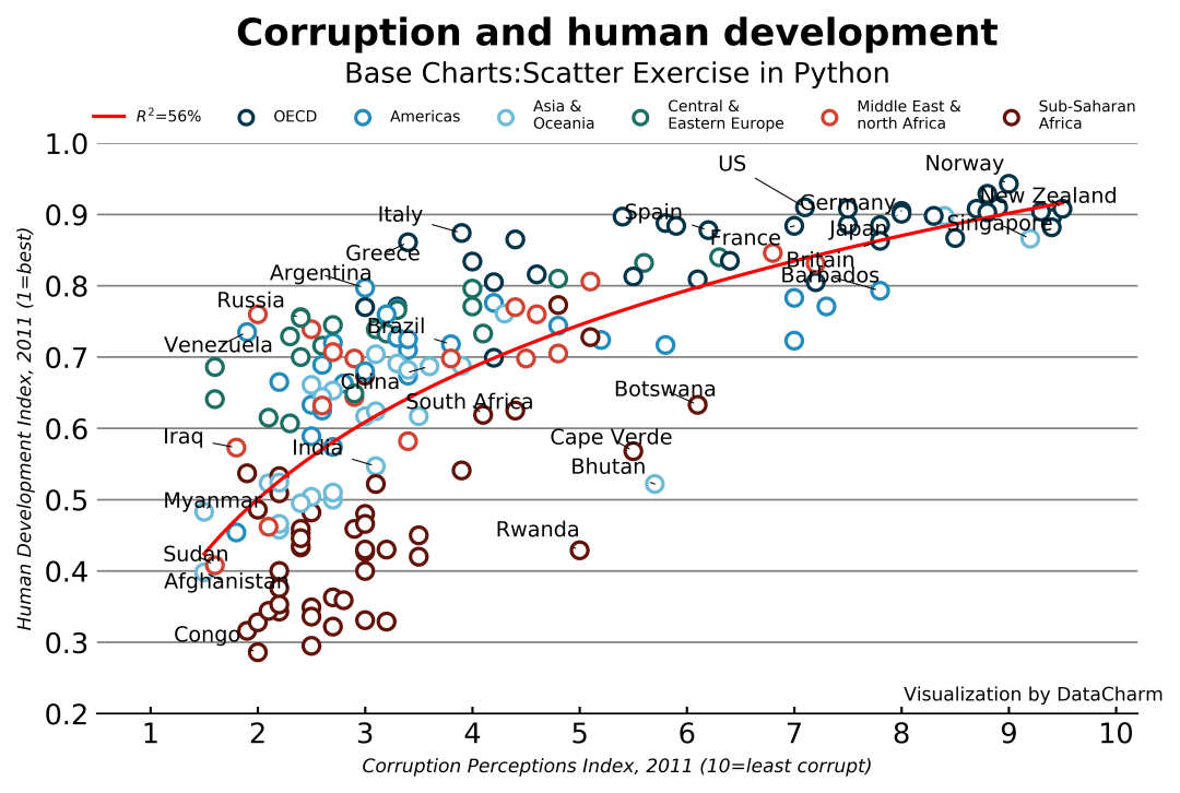
We directly put the visualization code drawn, and then explain separately, the code is as follows:
fig,ax = plt.subplots(figsize=(8,4.5),dpi=200,facecolor='white',edgecolor='white')
ax.set_facecolor("white")

color =[region_color[i]for i in test_data['Region_new']]

fit_line = sns.regplot(data=test_data,x="CPI",y="HDI",logx=True,ci=False,
      line_kws={"color":"red","label":r"$R^2$=56%","lw":1.5},
      scatter_kws={"s":50,"fc":"white","ec":color,"lw":1.5,"alpha":1},
      ax=ax)

texts =[]for i, j ,t  inzip(data_text["CPI"],data_text["HDI"],data_text["Country"]):
 texts.append(ax.annotate(t,xy=(i, j),xytext=(i-.8,j),
        arrowprops=dict(arrowstyle="-", color="black",lw=.5),
        color='black',size=9))adjust_text(texts,only_move={'text':'xy','objects':'x','point':'y'})
# adjust_text(texts,only_move={'text':'xy'})

ax.set_xlabel("Corruption Perceptions Index, 2011 (10=least corrupt)",fontstyle="italic",
    fontsize=8)

ax.set_ylabel("Human Development Index, 2011 (1=best)",fontstyle="italic",fontsize=8)

ax.set_xlim((.5,10.2))
ax.set_ylim((.2,1))
ax.set_xticks(np.arange(1,10.3, step=1))
ax.set_yticks(np.arange(0.2,1.05, step=0.1))

# Grid settings
ax.grid(which='major',axis='y',ls='-',c='gray',)
ax.set_axisbelow(True)
# Shaft ridge setting
for spine in['top','left','right']:
 ax.spines[spine].set_visible(None) #Hidden Axial Ridge
ax.spines['bottom'].set_color('k') #Set bottom color
# Scale settings, only display the bottom scale, and the direction is outward, and the length and width are also set
ax.tick_params(bottom=True,direction='in',labelsize=12,width=1,length=3,
    left=False)

# Add legend
ax.scatter([],[], ec='#01344A', fc="white",label='OECD', lw=1.5)
ax.scatter([],[], ec='#228DBD', fc="white",label='Americas', lw=1.5)
ax.scatter([],[], ec='#6DBBD8', fc="white",label='Asia & \nOceania', lw=1.5)
ax.scatter([],[], ec='#1B6E64', fc="white",label='Central & \nEastern Europe', lw=1.5)
ax.scatter([],[], ec='#D24131', fc="white",label='Middle East & \nnorth Africa', lw=1.5)
ax.scatter([],[], ec='#621107', fc="white",label='Sub-Saharan \nAfrica', lw=1.5)
ax.legend(loc="upper center",frameon=False,ncol=7,fontsize=6.5,bbox_to_anchor=(0.5,1.1))

ax.text(.5,1.19,"Corruption and human development",transform = ax.transAxes,ha='center',
  va='center',fontweight="bold",fontsize=16)

ax.text(.5,1.12,"Base Charts:Scatter Exercise in Python",
  transform = ax.transAxes,ha='center', va='center',fontsize =12,color='black')
ax.text(.9,.05,'\nVisualization by DataCharm',transform = ax.transAxes,
  ha='center', va='center',fontsize =8,color='black')
「Knowledge Point」
- Color dictionary construction to facilitate the assignment of scattered colors
color =('#01344A','#228DBD','#6DBBD8','#1B6E64','#D24131','#621107')
region =("OECD","Americas","Asia & \nOceania","Central & \nEastern Europe","Middle East & \nnorth Africa","Sub-Saharan \nAfrica")
region_color =dict(zip(region,color))

color =[region_color[i]for i in test_data['Region_new']]

# In regplot()Call as follows
scatter_kws={"s":50,"fc":"white","ec":color,"lw":1.5,"alpha":1}
- adjust_text() method to add ax.annotate attribute
texts =[]for i, j ,t  inzip(data_text["CPI"],data_text["HDI"],data_text["Country"]):
 texts.append(ax.annotate(t,xy=(i, j),xytext=(i-.8,j),
        arrowprops=dict(arrowstyle="-", color="black",lw=.5),
        color='black',size=9))adjust_text(texts,only_move={'text':'xy','objects':'x','point':'y'})
- matplotlib customized legend settings
# Add legend
ax.scatter([],[], ec='#01344A', fc="white",label='OECD', lw=1.5)
ax.scatter([],[], ec='#228DBD', fc="white",label='Americas', lw=1.5)
ax.scatter([],[], ec='#6DBBD8', fc="white",label='Asia & \nOceania', lw=1.5)
ax.scatter([],[], ec='#1B6E64', fc="white",label='Central & \nEastern Europe', lw=1.5)
ax.scatter([],[], ec='#D24131', fc="white",label='Middle East & \nnorth Africa', lw=1.5)
ax.scatter([],[], ec='#621107', fc="white",label='Sub-Saharan \nAfrica', lw=1.5)
ax.legend(loc="upper center",frameon=False,ncol=7,fontsize=6.5,bbox_to_anchor=(0.5,1.1))
The final visualization effect is as follows:
to sum up
In this issue, we have launched recurring tweets of Python-seaborn’s classic visualization works. Although the final result still has problems (of course, you can customize the specific location to solve), the main purpose is to let everyone learn drawing skills, especially when it comes to The drawing of the fitting curve (if you have wheels, just use it directly, don't think about recreating it yourself).