Python drawing | entry-level explanation of weather radar & a variety of radar image visualization methods
Introduction to Weather Radar
Meteorological radar is a radar specially used for atmospheric detection. It is an active microwave atmospheric remote sensing equipment.
Meteorological radar is an important equipment for meteorological observation, especially in sudden and disastrous monitoring, forecasting and warning, it is the main detection tool for small-scale weather systems (such as typhoons and storm clouds) one.
In China, the most common weather radar we see and use is the new generation Doppler weather radar (CINRAD). Most of the spherical buildings we saw on the roofs of buildings such as the Weather Bureau belong to this kind of radar. This kind of radar can detect basic meteorological elements such as reflectance factor, Doppler radial velocity, spectral width, etc., so as to provide data support for weather forecasting and early warning on short-term scale. Especially radar reflectivity data, because it is directly related to strong convective weather systems, is most often used by everyone.
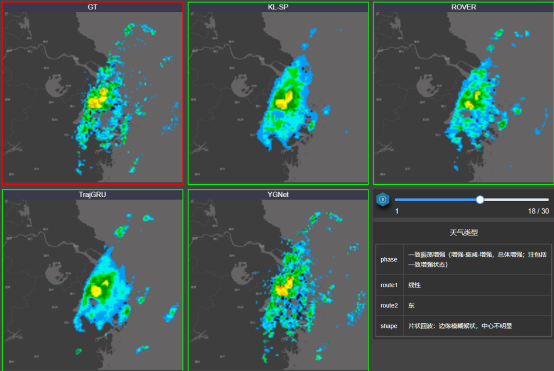
There are many applications of radar data in daily business scientific research. For example, radar data can be used in numerical model assimilation to provide a more accurate initial field for the numerical model; radar short-term forecast based on radar reflectivity data The system** can forecast strong convective weather within the radar detection range in the next 2 hours. For example, the AI convective nowcasting system based on deep learning independently developed by Eye Control Technology uses radar reflectivity data to accurately forecast strong convective weather in the next two hours. After taking a look, the forecast below is indeed very effective.
Working principle of weather radar
To understand the data structure of weather radar, you must first know how radar works. For this reason, I deliberately learned the relevant knowledge again. Interested friends can also take a look: Learning Resources | Radar Meteorology Course ( Nanxin University official)
The radar mainly has the following scanning forms:
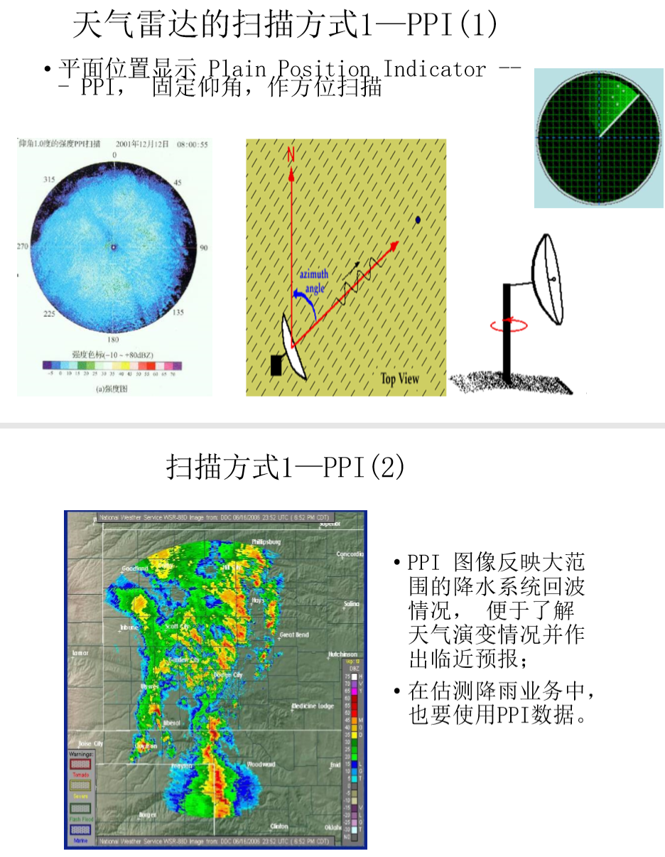
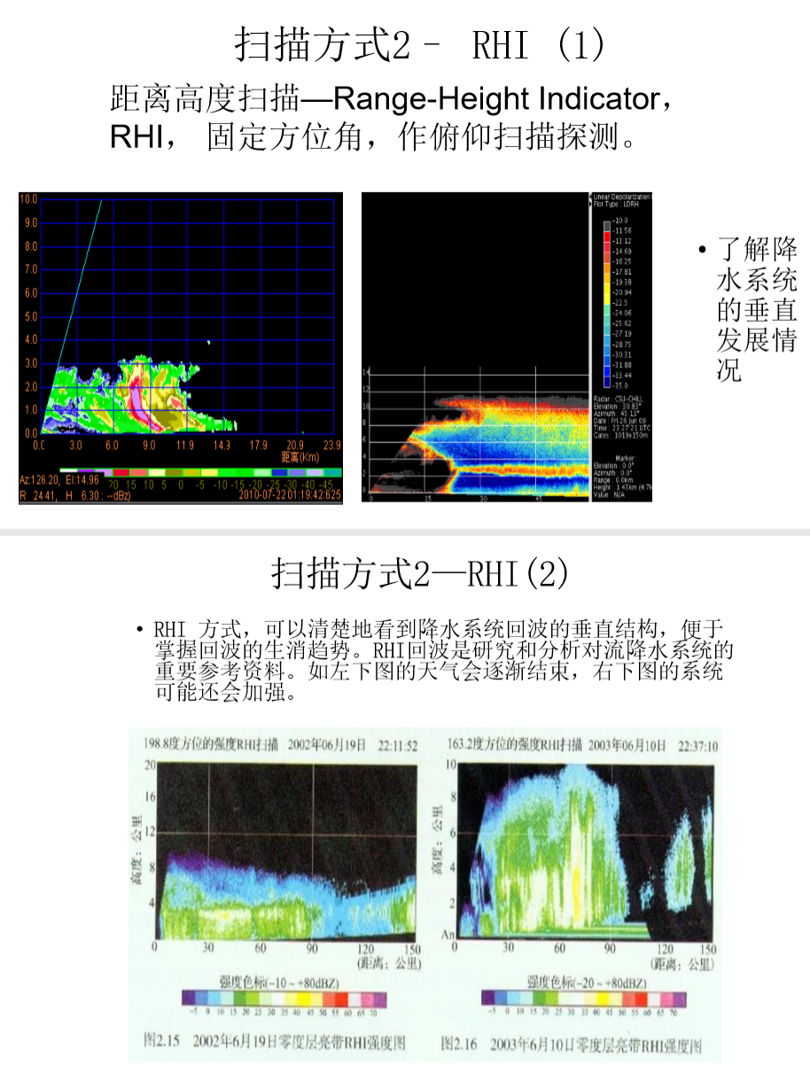
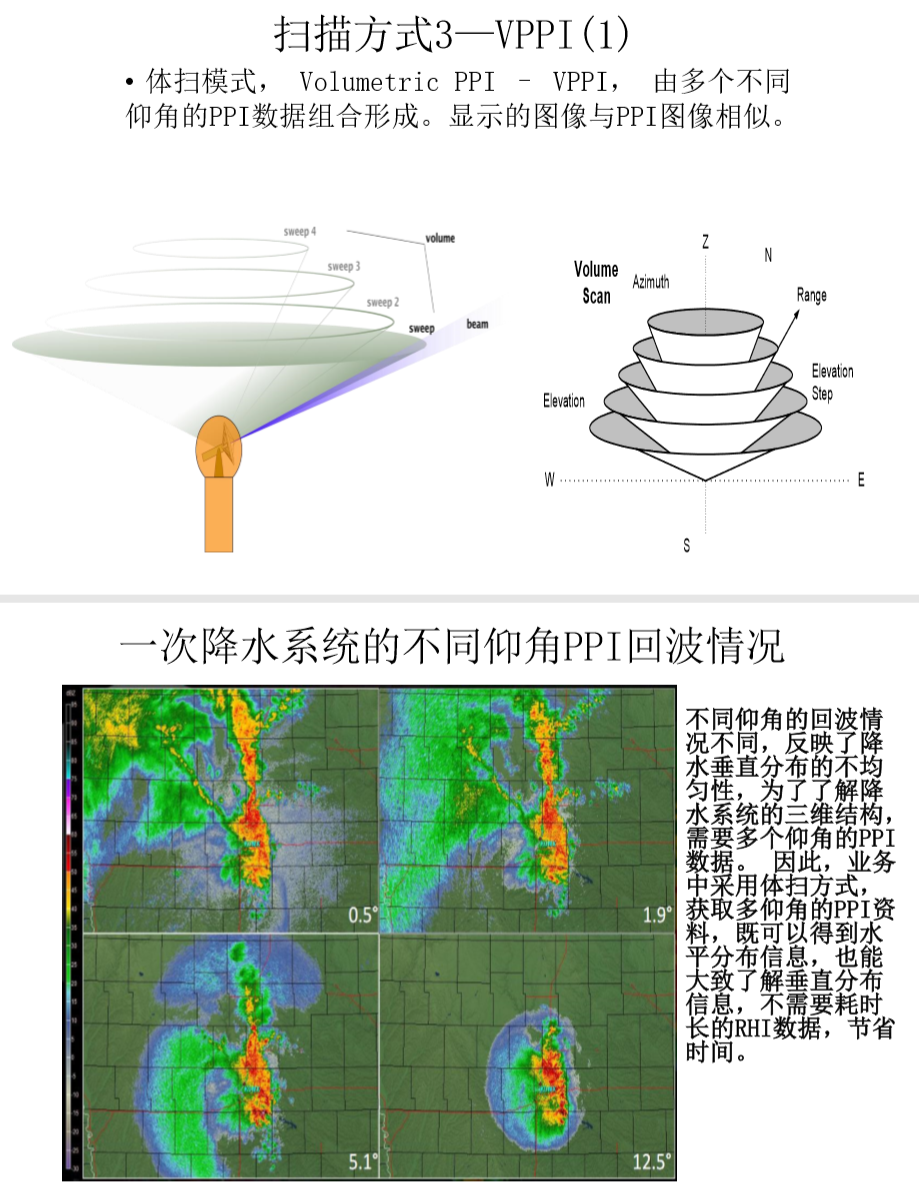
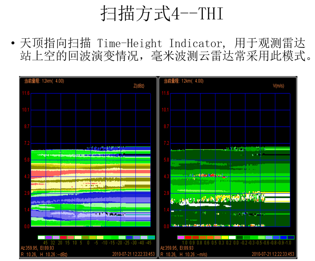
Generally speaking, the conventional scanning method of radar in the business is VPPI. During scanning, the radar antenna starts from the lowest elevation angle in the self-scanning mode, and starts from the zero degree azimuth angle with a fixed elevation angle. (During the working process of Doppler weather radar, The north is 0° azimuth, the true east is 90° azimuth, the antenna parallel to the horizontal plane is 0° elevation angle, and when it is perpendicular to the horizontal plane, it is 90° elevation angle.) Start rotating the antenna clockwise, and complete the single-layer elevation angle by azimuth. Scanning, recording the reflectance factor, radial Doppler velocity, spectral width and other meteorological elements necessary to generate basic radar products while continuously transmitting and receiving electromagnetic waves.
After the single-layer elevation angle scan is completed, the radar antenna is raised to the next elevation angle in the corresponding body scan mode to continue the above process until the scan of all specified elevation angles is completed.
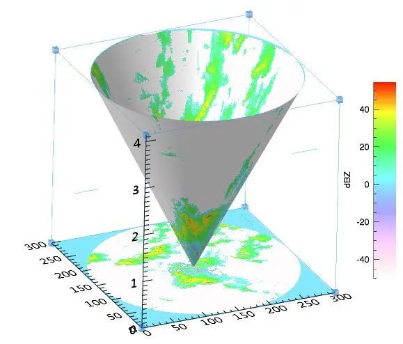
After a scan is completed, what we actually obtain is a full circle of meteorological elements at different elevation angles. From the perspective of three-dimensional space, it is a conical surface with different inclination angles with the radar site as a fixed point, which together constitute the three-dimensional observation of the radar. The figure below is a schematic diagram of one of the elevation scans.
Use python to read CINRAD radar data
Generally speaking, we need to use pyart or wradlib, or even read the binary file directly according to the radar data format, and then perform some necessary processing to read the radar data smoothly.
Fortunately, for the most common CINRAD radar data in China, @CyanideCN teacher has developed a library PyCINRAD, which allows us to easily process and visualize CINRAD data. Using PyCINRAD, we can easily read the radar base data as xarray.Dataset
# Load the required packages
import math
import time
from itkwidgets import view
import matplotlib.pyplot as plt
import matplotlib.ticker as mticker
import numpy as np
from matplotlib import colors
from scipy.interpolate import griddata
import scipy.misc
import cartopy.crs as ccrs
import cartopy.feature as cfeat
import cinrad
import xarray as xr
from cartopy.mpl.gridliner import LATITUDE_FORMATTER, LONGITUDE_FORMATTER
from cinrad.io import CinradReader, StandardData
from cinrad.visualize import PPI,Section
from mayavi import mlab
import numpy as np
import matplotlib.pyplot as plt
from matplotlib import cm
from mpl_toolkits.mplot3d import Axes3D
import pandas as pd
import plotly.express as px
%matplotlib inline
Use cinrad.io.CinradReader to open the binary radar base data file
f =CinradReader("Z_RADR_I_Z9250_20200612054800_O_DOR_SA_CAP.bin")
View the types of products included
f.available_product(0)

Get radar scan elevation angle
f.get_elevation_angles()

View data type
ele =0 #Select the first elevation angle
radius =400 #The size of the drawing image range, in km
r = f.get_data(ele,radius,"REF") #Select reflectivity data
r
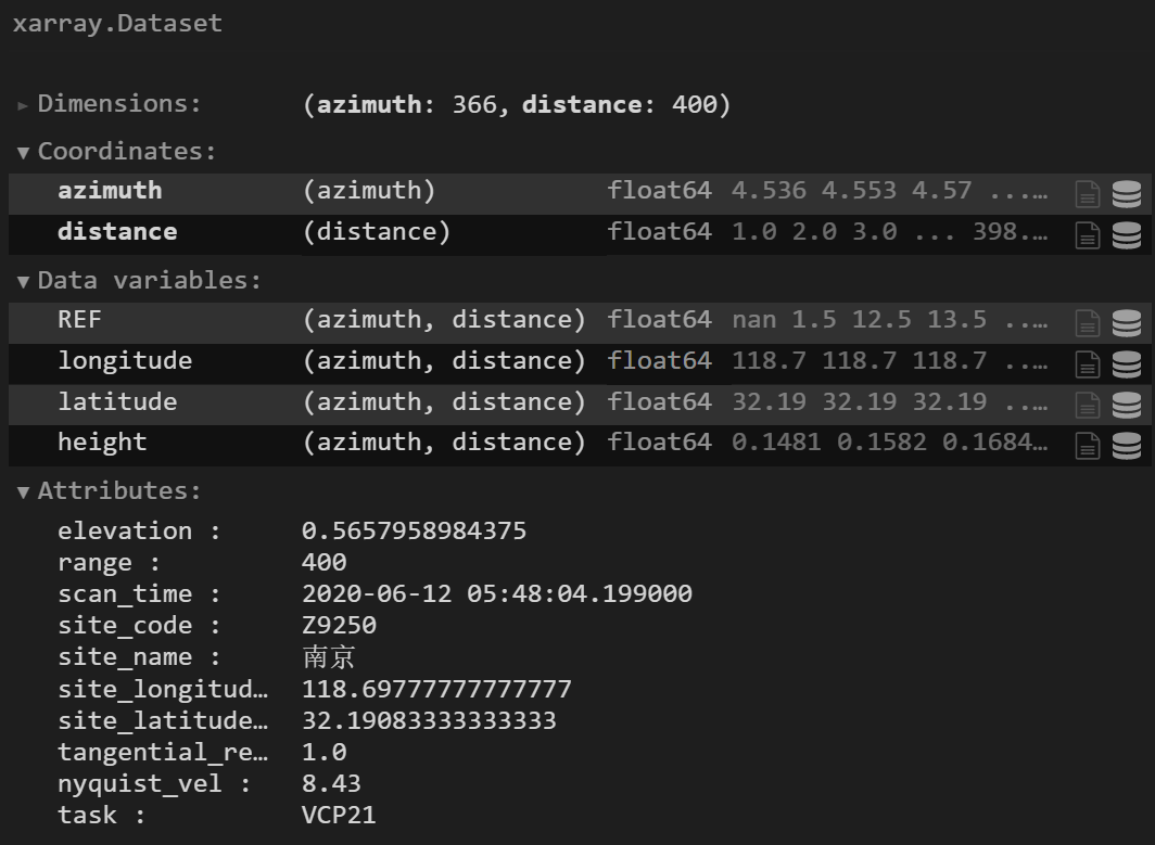
Through the above code, we can understand the storage structure of radar data. It can be seen intuitively that the radar reflectivity data of each layer is actually composed of two dimensions. One is the azimuth (azimuth), which represents the angle at which each radar emits electromagnetic waves; the other is the distance (distance), which actually represents the distance between each observation point of the radar and the radar station . In fact, the radar reflectivity data we obtain for each layer is a three-dimensional conical surface composed of about 360 rays, and meteorological elements at points every 1 km on each ray. Here, the PyCinrad library calculates the specific latitude, longitude and height values of each point on the cone at the same time. With these values, it can help us to visualize in 2D and 3D Cartesian coordinates more conveniently.
Two-dimensional visualization
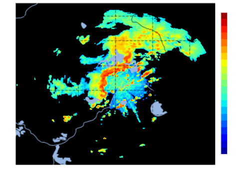
After getting a xarray.Dataset, it is natural to simply use cartopy to visualize it.
ref = r.REF

proj = ccrs.PlateCarree()#To create a projection, select the platecarree projection of cartopy
fig = plt.figure(figsize=(6,6))  #Create a page, you can choose the size
ax = fig.subplots(1,1, subplot_kw={'projection': proj})  #Subgraph

# National borders, coastlines, rivers, lakes
ax.add_feature(cfeat.BORDERS.with_scale('50m'), linewidth=0.8, zorder=1)
ax.add_feature(cfeat.COASTLINE.with_scale('50m'), linewidth=0.6, zorder=1)
ax.add_feature(cfeat.RIVERS.with_scale('50m'), zorder=1)
ax.add_feature(cfeat.LAKES.with_scale('50m'), zorder=1)

gl = ax.gridlines(crs=ccrs.PlateCarree(),draw_labels=True,
 linewidth=1.2, color='k', alpha=0.5, linestyle='--')
gl.top_labels = False  #Close top label
gl.right_labels = False  #Close right label
gl.xformatter = LONGITUDE_FORMATTER  #x-axis is set to longitude format
gl.yformatter = LATITUDE_FORMATTER  #y-axis is set to latitude format
color_max=int(ref.max())+1
color_min=int(ref.min())
n_gap=(color_max-color_min)/20

# cmap
levels = np.arange(color_min,color_max+n_gap,n_gap)
plt.contourf( r.longitude, r.latitude,ref,levels=levels,cmap='jet')
# colorbar lower left width and height
l =0.92
b =0.23
w =0.025
h =0.55
# Corresponding to l,b,w,h; set the colorbar position;
rect =[l,b,w,h]
cbar_ax = fig.add_axes(rect)
plt.colorbar( cax=cbar_ax)
plt.show()
PPI visualization
You can also use some of the visualization functions that come with the PyCinrad library to directly visualize PPI. First, define a function to draw ppi.
tip: Use cinrad.visualize.PPI to directly visualize the PPI, sometimes it takes two runs of the cell to render a black background image.
def ppi_plot(data):
 fig =PPI(data,dpi=75,add_city_names=True)
 fig.plot_range_rings(radius, color='white', linewidth=1.0) #Draw a circle
 for i inrange(0,radius-30,50):
  fig.plot_range_rings(i, color='white', linewidth=1.0) #Draw a circle
 # Set latitude and longitude
 liner = fig.geoax.gridlines(draw_labels=True,linewidth=2, color='gray', alpha=0.5, linestyle='--') #Set latitude and longitude dotted line
 liner.top_labels = False
 liner.right_labels = False
 liner.xformatter = LONGITUDE_FORMATTER
 liner.yformatter = LATITUDE_FORMATTER
 liner.xlabel_style ={'size':18,'color':'red','weight':'bold'} #Set latitude, longitude, color, font size, etc.
 liner.ylabel_style ={'size':18,'color':'red','weight':'bold'}
Draw radar emissivity graph
ppi_plot(r)
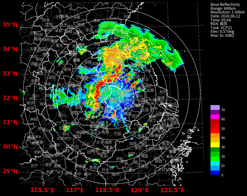
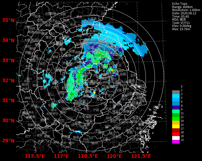
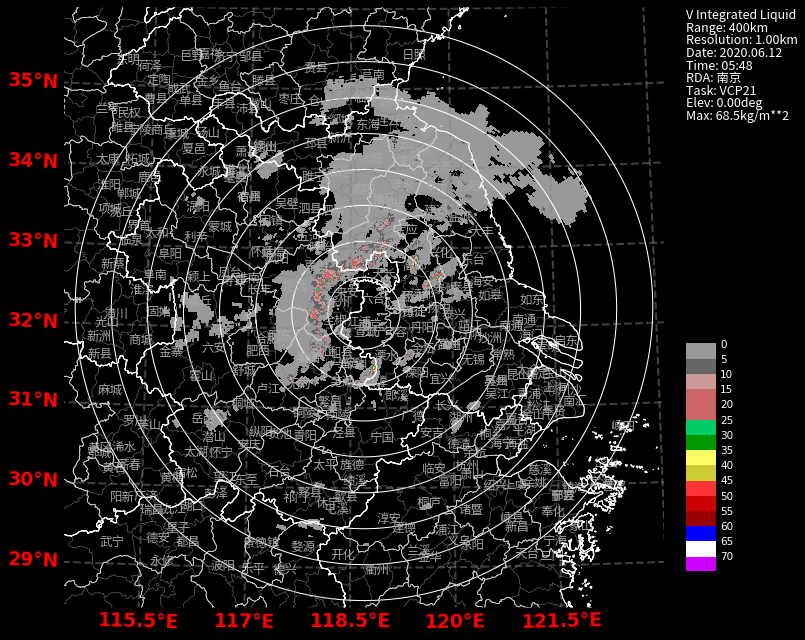
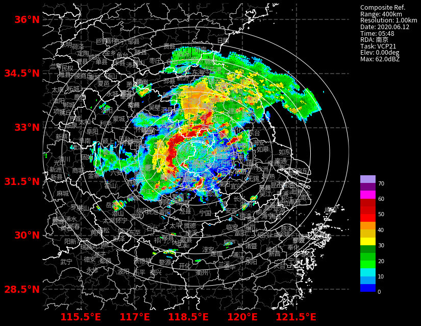
In addition to radar reflectivity, PyCinrad also has methods for calculating vertical integrated liquid (VIL), echo tops (ET), composite reflectivity (CR), etc.
Draw echo top height
et = cinrad.calc.quick_et([f.get_data(i,400,'REF')for i in f.angleindex_r])ppi_plot(et)
Draw vertical cumulative liquid water
vil = cinrad.calc.quick_vil([f.get_data(i,400,'REF')for i in f.angleindex_r])ppi_plot(vil)
Draw combined reflectivity
cr = cinrad.calc.quick_cr([f.get_data(i,400,'REF')for i in f.angleindex_r])
RHI Visualization
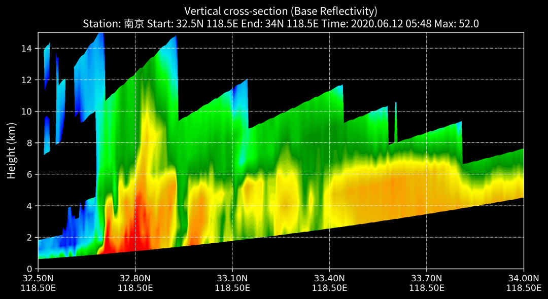
Since the daily radar business data is not scanned by RHI, if you want to obtain the vertical profile of the radar, you can select cinrad.calc.VCS to calculate the vertical echo intensity of the radar before drawing.
rl =[f.get_data(i,400,'REF')for i in f.angleindex_r]
vcs = cinrad.calc.VCS(rl)
sec = vcs.get_section(start_cart=(118.5,32.5), end_cart=(118.5,34)) #Incoming longitude and latitude coordinates
fig =Section(sec)
Draw a combination chart
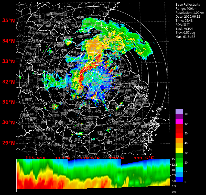
PyCinrad also supports drawing a combination diagram of PPI and RHI at the same time
rl =[f.get_data(i,400,'REF')for i in f.angleindex_r]
vcs = cinrad.calc.VCS(rl)
sec = vcs.get_section(start_cart=(118.0,32.5), end_cart=(119.0,33.5)) #Incoming longitude and latitude coordinates

fig =PPI(rl[0],dpi=75,add_city_names=True)
fig.settings['is_inline']= False
fig.plot_range_rings(radius, color='white', linewidth=1.0) #Draw a circle
for i inrange(0,radius-30,50):
 fig.plot_range_rings(i, color='white', linewidth=1.0) #Draw a circle

fig.plot_cross_section(sec)  #Draw vertical section
liner = fig.geoax.gridlines(draw_labels=True,linewidth=2, color='gray', alpha=0.5, linestyle='--') #Set latitude and longitude dotted line
liner.top_labels = False
liner.right_labels = False
liner.xformatter = LONGITUDE_FORMATTER
liner.yformatter = LATITUDE_FORMATTER
liner.xlabel_style ={'size':18,'color':'red','weight':'bold'} #Set latitude, longitude, color, font size, etc.
liner.ylabel_style ={'size':18,'color':'red','weight':'bold'}
3D visualization
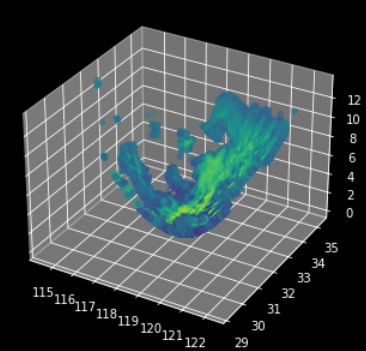
Radar data is not distributed on a curved surface. Under the Cartesian coordinate system of longitude-latitude-height, the PPI data of the first layer is distributed on a conical surface in three-dimensional space, so it can be visualized in three dimensions.
Matmatplotlib three-dimensional static visualization
fig = plt.figure()
ax =Axes3D(fig)  #Create 3D drawing space
X = r.longitude.values.flatten() #Read the longitude, latitude, altitude and reflectivity values in ppi and convert them into one-dimensional
Y = r.latitude.values.flatten()
Z = r.height.values.flatten()
value = r.REF.values.flatten()
ax.scatter(X, Y, Z, c=value) #Draw a scatter plot
plotly three-dimensional dynamic visualization
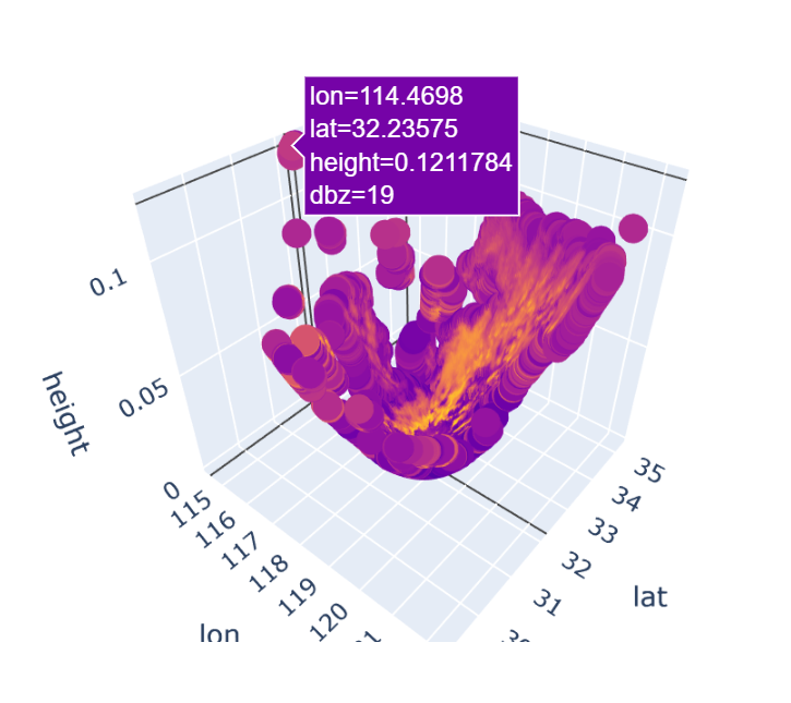
You need to be in jupyter to interact
# Take out longitude, latitude, height, reflectivity
X = r.longitude.values
Y = r.latitude.values
Z = r.height.values
value = r.REF.values
# Create a new dataframe, save the scattered information
df = pd.DataFrame({"lon":X.flatten(),"lat":Y.flatten(),"height":Z.flatten()/110,"dbz":value.flatten()})
df = df.dropna()  #Remove the point of nan
# The generated image can be dragged
fig = px.scatter_3d(df, x='lon', y='lat', z='height',color='dbz')
fig.show()
The last thing I want to say is that this article is a very brief introduction, and it can only be regarded as a first glimpse into this field. The application of radar in the field of meteorology is very rich. Interested friends can learn more about radar knowledge. It is always right to lay a solid foundation. This is the official course link of Nanxin University. If you need it, please take it yourself: Learn Resources | Radar Meteorology Course (Nanxin University Official)