Introduction to Python commonly used visualization libraries
Let me talk about the business first, this will be a series of articles about Python visualization. The use of different Python visualization libraries will be updated from the shallower to the deeper. This article is equivalent to the opening one. Let me first introduce the libraries that will be used in this series.
**It's a proof, welcome everyone to remind panda daily. **
About the environment
Python IDE:Jupyter Notebook
Python environment: Anaconda integrated environment
Environment setup tutorial link: Python environment installation
Series Preface
There are many libraries for visualization in Python, and nearly 20 libraries can do Data Visualization for incomplete statistics. Different libraries have their own characteristics and preferences.
In this series, we will select the most frequently used libraries to share. In fact, the code is nothing more than the difference in method parameters. The core is to master the logic and learn the content of this series. In actual combat, it is very simple to find other methods based on the situation.
In this series, we are about to share the contents of the three visualization libraries Matplotlib, Seaborn, and pyEcharts. In addition, the brewer2mpl color palette library may also be involved. Because it is data visualization, the use of data processing libraries is definitely indispensable, such as Numpy and **Pandas. **
Some of these libraries are already integrated in Anaconda, and some need to be installed separately. Don't worry, the installation instructions will be attached before sharing. Hum
Matplotlib
Matplotlib is a visualization toolkit that comes with Python and one of the most commonly used visualization libraries. Many other libraries are based on it.
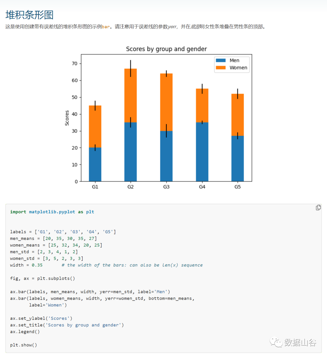
The picture below is taken from some cases in the official website of Matplotlib. Each picture has a corresponding code. For example, the first stacked bar chart, click in and there will be related case codes. And all support copy download.
But here comes the problem, the code of each example is not simple. There is no comment to refer to. It is still very sad for beginners, so in this series we will choose some classic and commonly used pictures to disassemble and share.
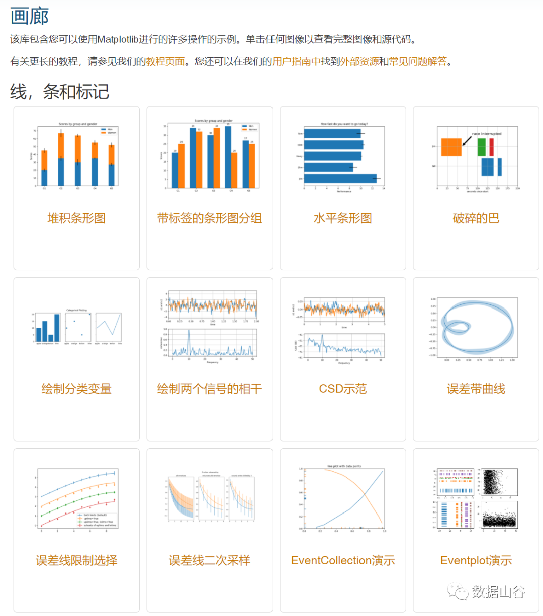
Official document link: https://matplotlib.org/
Seaborn
Seaborn is a more advanced package based on Matplotlib, so that the graph has more themes to choose from, and it is easier to make good-looking pictures. Usually Seaborn can make attractive graphs, while using Matplotlib Can make more basic maps. Seaborn is to make difficult things easier. The biggest difficulty with Matplotlib is that there are many default parameters in many methods, and Seaborn completely avoids this problem. So we can think of Seaborn as a supplement to Matplotlib or an upgrade PLUS, not its replacement. In daily use, the two libraries are generally used in combination.
In addition, like the Matplotlib library, Seaborn is highly compatible with numpy and pandas data structures, as well as statistical data such as scipy and statsmodels.
Official document link: https://seaborn.pydata.org/
pyEcharts
Speaking of pyecharts, you have to mention Echarts. Echarts is a data visualization platform open sourced by Baidu, which has this very good interactivity. And the initial model of the chart is very beautiful and exquisite, which has been very recognized in the industry. You can simply take a look at the chart below to experience the chart made on the Echarts platform.
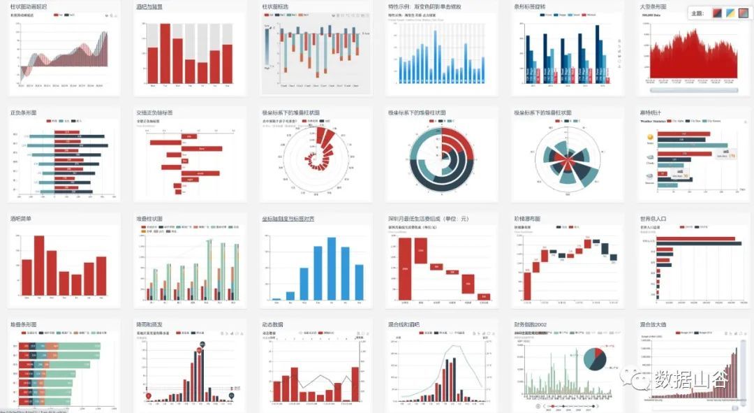
The above picture is from the sample library of the Echarts platform. In addition to the good looks, the interaction effect is also very good. When the mouse is placed on the corresponding position, the corresponding information will be displayed (you can make up your own brain).
**What is the connection between the powerful Echarts and Python? **
We all know that Python, as a programming language that is very easy to get started without a programming foundation, has very powerful and fast functions for data processing. So when data processing meets visualization, the pyecharts library was born.
The pyecharts library has a very concise API design, and when calling methods, it is silky smooth. Contains more than 30 commonly used charts, with very highly flexible configuration items, you can easily match up with beautiful charts. He inherited mainstream web frameworks such as flask and django. And with the support of Baidu Maps, it has a unique advantage when processing geographic data.
Official document link: https://pyecharts.org/
Recommended Posts