python drawing | scatter bubble drawing on space map
Today’s tweet tutorial uses geopandas to draw spatial charts (geopandas spatial drawing is very convenient, saving a lot of data processing, and it is also perfectly connected to matplotlib, and friends who learn python spatial drawing can see it), specifically for space The main content of the bubble chart is as follows:
- geopandas geojson data format reading and visual display
- Separately add scatter size legend layer
- adjustText library solves the problem of text overlap
geopandas geojson data manipulation
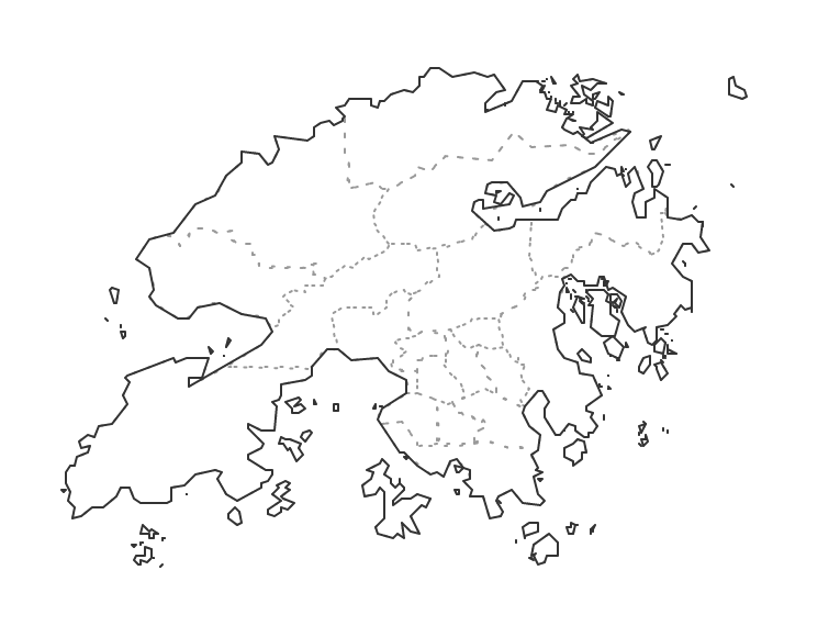
Here we select the geojson file data of the Hong Kong map. Such files can be downloaded in the DAtAV map selector. The downloaded file is named Hong Kong Special Administrative Region.json, and the visualization effect is as follows:
Data reading
Use geopandas' read_file() method to easily read data, the code is as follows:
hk_file = r"F:\DataCharm\Business art graphic imitation\Hong Kong map visualization\Hong Kong Special Administrative Region.json"
hk = geopandas.read_file(hk_file)
For more geopandas methods to read data, please refer to the official website of geopandas for learning.
Data visualizationdisplay
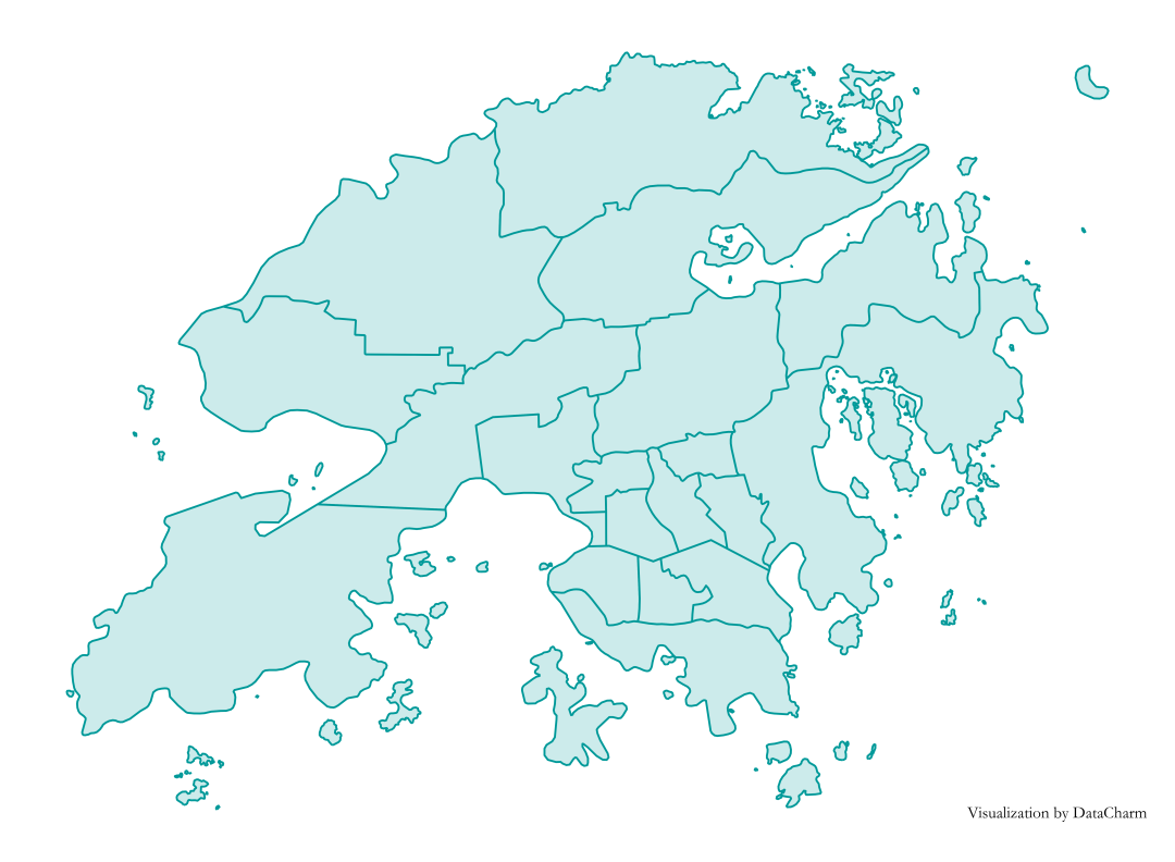
After reading the data, we can directly use the plot() method of geopandas to draw, the code is as follows (with simple color settings):
fig, ax = plt.subplots(figsize=(10,8),dpi=200)

hk_map = hk.geometry.plot(ax=ax,fc="#CCEBEB",ec="#009999",lw=1)
ax.text(.91,0.05,'\nVisualization by DataCharm',transform = ax.transAxes,
  ha='center', va='center',fontsize =8)

ax.axis('off') #Remove axis
plt.savefig('hk_charts_pir.png',width=8,height=8,
   dpi=900,bbox_inches='tight',facecolor='white')
The results are as follows:
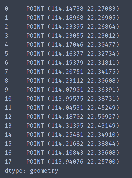
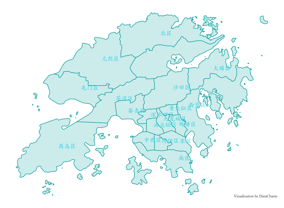
- Area name text addition: In the read data results, name is listed as the corresponding area name. Use the hk.geometry.representative_point() method to calculate the longitude and latitude information of its representative points for drawing the text position. The results are as follows:
Then add text by using the ax.text() method, the code is as follows:
for loc, label inzip(hk.geometry.representative_point(),hk.name):
 ax.text(loc.x,loc.y,label,size=13,color="#0DCFE3")
The results are as follows:
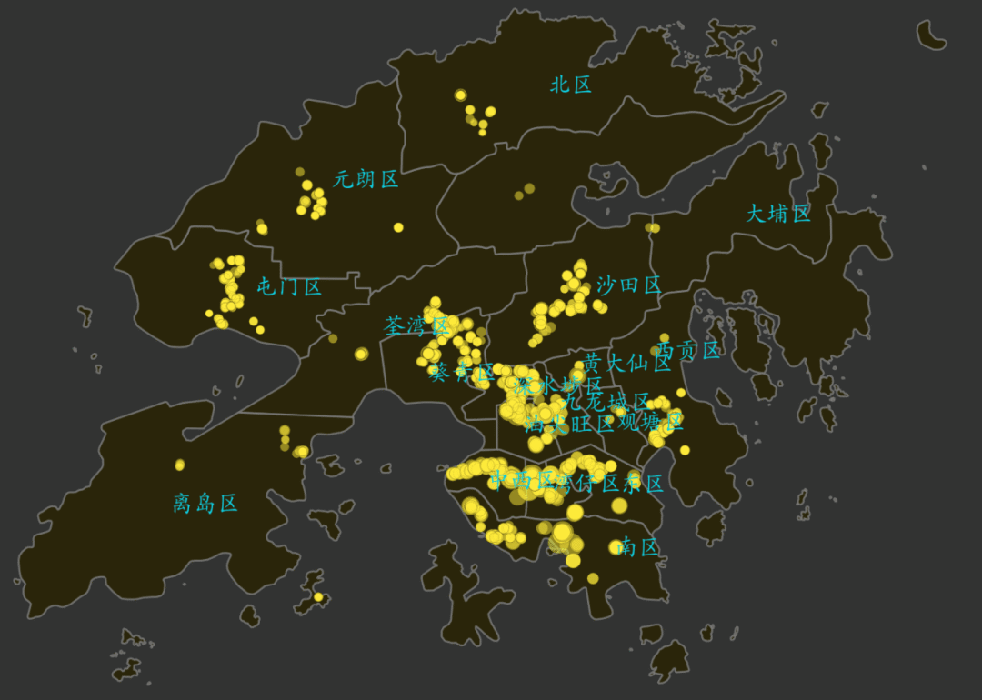
Add bubble scatter data
The data source here is my friend J’s official account: Cai J learns Python, thanks for providing data support. Since the latitude and longitude of the data are parsed directly based on the Gaode map, some of the latitude and longitude information of the data is wrong. We use pandas for simple data filtering, and will not show the details. A series of tutorial tweets will be launched later. The data preview is as follows:
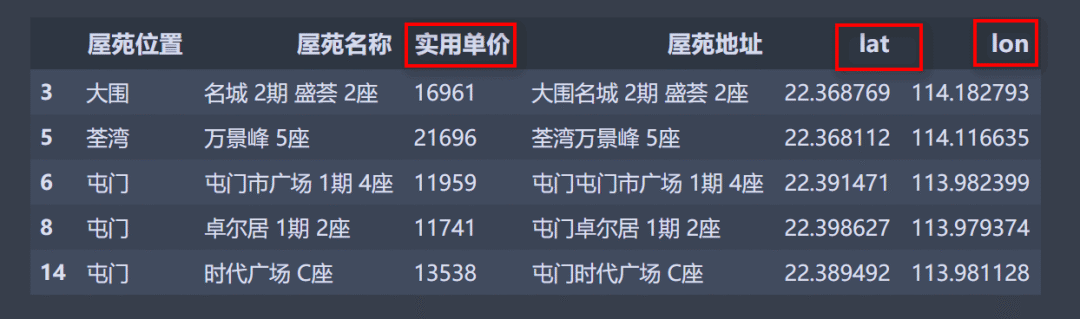
Here we mainly use the data in the red box for drawing, that is, use the scatter() method and set the size of the scattered points reasonably. The code is as follows:
for x,y,price inzip(scatter_se.lon,scatter_se.lat,scatter_se['Practical unit price']):
 hk_map.scatter(x,y,s=price/500,color='#FFEB3B',alpha=.5,ec='k',lw=.1)
After some customized settings, the effect is as follows:
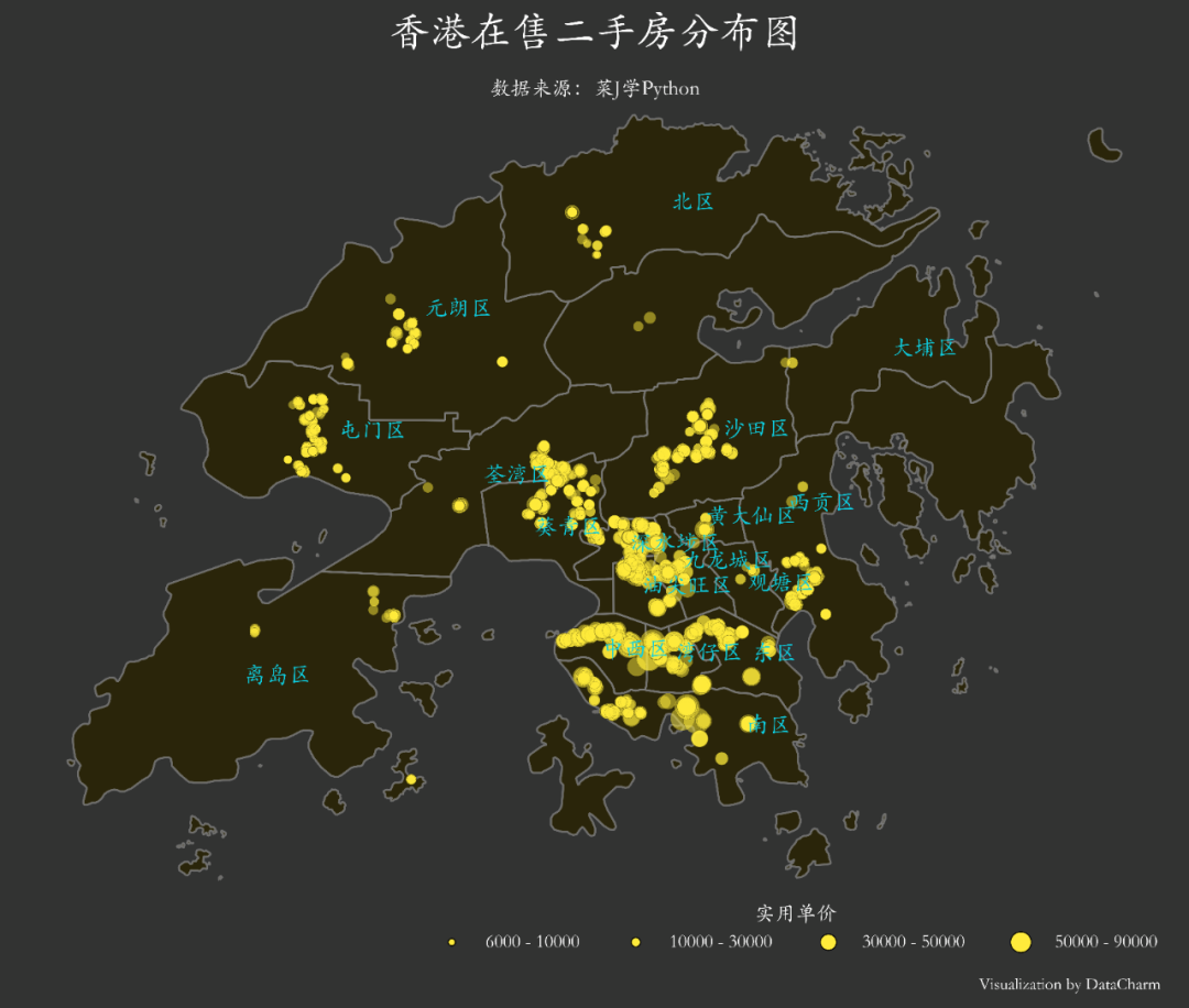
Add Bubble Legend
Here we are not directly generating the legend based on the data, but separately drawing other layers to generate the legend. The advantage of this is that the color and size of the required legend can be customized more freely. The code involved is as follows:
# Add a separate legend here
ax.scatter([],[], c='#FFEB3B', s=6000/500,
   label='6000 - 10000', edgecolor='black',lw=.5)
ax.scatter([],[], c='#FFEB3B', s=10000/500,
   label='10000 - 30000', edgecolor='black',lw=.5)
ax.scatter([],[], c='#FFEB3B', s=30000/500,
   label='30000 - 50000', edgecolor='black',lw=.5)
ax.scatter([],[], c='#FFEB3B', s=50000/500,
   label='50000 - 90000', edgecolor='black',lw=.5)
# Legend customization settings
legend = ax.legend(frameon=False,ncol=4,loc='lower right',title='Practical unit price',bbox_to_anchor=(1,-.06),
     fontsize=9)
legend.get_title().set_color('#ffffff')for text in legend.get_texts():
 text.set_color("#ffffff")
Pay attention to the second half of the code. This is a customized setting for matplotlib legend settings, and it also applies to other legends. The complete code for drawing is as follows:
fig, ax = plt.subplots(figsize=(10,8),dpi=200,facecolor='#323332',edgecolor='#323332')
ax.set_facecolor('#323332')
hk_map = hk.geometry.plot(ax=ax,fc="#292200",ec="gray",lw=1,alpha=.8)

# Adding text using the default text causes the text to overlap
for loc, label inzip(hk.geometry.representative_point(),hk.name):
 ax.text(loc.x,loc.y,label,size=11,color="#0DCFE3")for x,y,price inzip(scatter_se.lon,scatter_se.lat,scatter_se['Practical unit price']):
 hk_map.scatter(x,y,s=price/500,color='#FFEB3B',alpha=.5,ec='k',lw=.1)

ax.axis('off') #Remove axis

# Add a separate legend here
ax.scatter([],[], c='#FFEB3B', s=6000/500,
   label='6000 - 10000', edgecolor='black',lw=.5)
ax.scatter([],[], c='#FFEB3B', s=10000/500,
   label='10000 - 30000', edgecolor='black',lw=.5)
ax.scatter([],[], c='#FFEB3B', s=30000/500,
   label='30000 - 50000', edgecolor='black',lw=.5)
ax.scatter([],[], c='#FFEB3B', s=50000/500,
   label='50000 - 90000', edgecolor='black',lw=.5)
# Legend customization settings
legend = ax.legend(frameon=False,ncol=4,loc='lower right',title='Practical unit price',bbox_to_anchor=(1,-.06),
     fontsize=9)
legend.get_title().set_color('#ffffff')for text in legend.get_texts():
 text.set_color("#ffffff")
# Add necessary text: the same method is used for title here
ax.text(.5,1.05,"Distribution map of second-hand houses for sale in Hong Kong",transform = ax.transAxes,color="white",weight='bold',size=20,
  ha='center', va='center')
ax.text(.5,.985,'Data source: Cai J learns Python',transform = ax.transAxes,
  ha='center', va='center',fontsize =10,color='white')
ax.text(.91,-.07,'\nVisualization by DataCharm',transform = ax.transAxes,
  ha='center', va='center',fontsize =8,color='white')

plt.savefig('hk_charts.png',width=8,height=8,
   dpi=900,bbox_inches='tight',facecolor='#323332')
# ax.set_axisbelow(True)
plt.show()
Visualization effect:
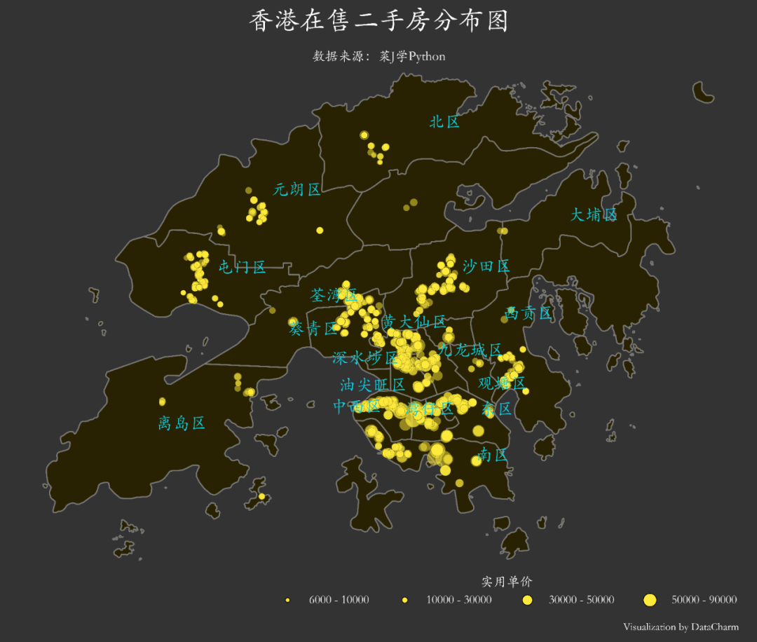
The adjustText library solves the problem of text overlap
You may find that the text in the result graph is more concentrated, which may cause inconvenience to reading. We only use the adjustText package to solve this problem. Here is the code for adding the text. The other steps are the same:
from adjustText import adjust_text
# Use adjustText to correct text overlap
new_texts =[ax.text(loc.x,loc.y,label,size=13,color="#0DCFE3")for loc, label in \
    zip(hk.geometry.representative_point(),hk.name)]adjust_text(new_texts,
   only_move={'text':'xy'},)
The visualization results are as follows:
to sum up
This tweet introduces the use of geopandas for spatial drawing. There are not many complete codes, but there are many knowledge points involved. I hope you can master it. In addition, the price data is obtained based on crawlers. How do you feel about a complete project process such as "data acquisition-data processing analysis-data visualization"? If the audience is large, I will prepare targeted tweets later. You can discuss and leave messages in the reader discussion area.
Recommended Posts