Python basic drawing tutorial (1)

As a scientific researcher, how to better draw images has always been a concern of the editor. Especially when writing a paper, a beautiful, well-made, and tall picture will be added to your paper invisibly The dream hits the wings of the top issue. This edition will teach you how to use Python to draw images.
Python is a familiar programming language with strong visualization capabilities. The more commonly used visualization libraries are mainly matplotlib (https://matplotlib.org/) and seaborn (http://seaborn.pydata. org/), geoplotlib (https://residentmario.github.io/geoplot/index.html), etc. These libraries are equipped with official tutorials and samples for everyone to learn. Interested readers can click to open The above link unlocks new skills by yourself. The editor here mainly introduces several image types commonly used in the field of geosciences.
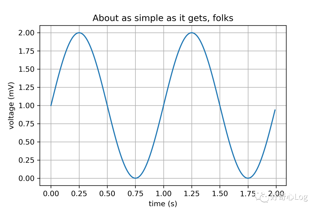
1 Line graph

import matplotlib
import matplotlib.pyplot as plt
import numpy as np

# Data for plotting
t = np.arange(0.0,2.0,0.01)
s =1+ np.sin(2* np.pi * t)

fig, ax = plt.subplots()
ax.plot(t, s)

ax.set(xlabel='time (s)', ylabel='voltage (mV)',
  title='About as simple as it gets, folks')
ax.grid()
plt.show()
2 Histogram/Probability Distribution Graph
import matplotlib
import numpy as np
import matplotlib.pyplot as plt

np.random.seed(19680801)

# example data
mu =100  # mean of distribution
sigma =15  # standard deviation of distribution
x = mu + sigma * np.random.randn(437)

num_bins =50

fig, ax = plt.subplots()

# the histogram of the data
n, bins, patches = ax.hist(x, num_bins, density=1)

# add a 'best fit' line
y =((1/(np.sqrt(2* np.pi)* sigma))*
  np.exp(-0.5*(1/ sigma *(bins - mu))**2))
ax.plot(bins, y,'--')
ax.set_xlabel('Smarts')
ax.set_ylabel('Probability density')
ax.set_title(r'Histogram: $\mu=100$, $\sigma=15$')

# Tweak spacing to prevent clipping of ylabel
fig.tight_layout()
plt.show()
3 Coloring map/heat map
import numpy as np
import matplotlib
import matplotlib.pyplot as plt
# sphinx_gallery_thumbnail_number =2

leadtime =["lead 1 mon","lead 2 mon","lead 3 mon","lead 4 mon","lead 5 mon","lead 6 mon"]
param =["Temperature","Wind","Precipitation","SLP","Humidity","Heat flux"]

coef = np.array([[0.95,0.9,0.85,0.8,0.82,0.7],[0.93,0.86,0.82,0.78,0.8,0.65],[0.88,0.82,0.8,0.72,0.75,0.62],[0.85,0.78,0.75,0.68,0.7,0.56],[0.8,0.72,0.7,0.65,0.68,0.5],[0.78,0.68,0.65,0.6,0.6,0.45],])

fig, ax = plt.subplots()

im, cbar =heatmap(coef, leadtime, param, ax=ax,
     cmap="PiYG", cbarlabel="Correlation Coefficient")
texts =annotate_heatmap(im, valfmt="{x:.2f}")

fig.tight_layout()
plt.show()
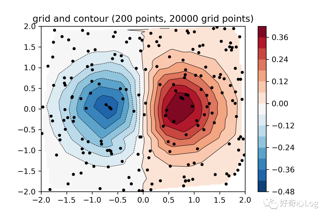
4 Point map & contour map

import matplotlib.pyplot as plt
import matplotlib.tri as tri
import numpy as np

np.random.seed(19680801)
npts =200
ngridx =100
ngridy =200
x = np.random.uniform(-2,2, npts)
y = np.random.uniform(-2,2, npts)
z = x * np.exp(-x**2- y**2)

fig, ax1 = plt.subplots()
# -----------------------
# Interpolation on a grid
# -----------------------
# A contour plot of irregularly spaced data coordinates
# via interpolation on a grid.
# Create grid values first.
xi = np.linspace(-2.1,2.1, ngridx)
yi = np.linspace(-2.1,2.1, ngridy)

# Linearly interpolate the data(x, y)
# on a grid defined by(xi, yi).
triang = tri.Triangulation(x, y)
interpolator = tri.LinearTriInterpolator(triang, z)
Xi, Yi = np.meshgrid(xi, yi)
zi =interpolator(Xi, Yi)

# Note that scipy.interpolate provides means to
# interpolate data on a grid as well. The following
# would be an alternative to the four lines above:
# from scipy.interpolate import griddata
ax1.contour(xi, yi, zi, levels=14, linewidths=0.5, colors='k')
cntr1 = ax1.contourf(xi, yi, zi, levels=14, cmap="RdBu_r")
fig.colorbar(cntr1, ax=ax1)
ax1.plot(x, y,'ko', ms=3)
ax1.set(xlim=(-2,2), ylim=(-2,2))
ax1.set_title('grid and contour (%d points, %d grid points)'%(npts, ngridx * ngridy))
plt.show()
This is the end of the introduction of this issue. The code in the article can be swiped horizontally. For the convenience of practical operation, the relevant code and samples have been stored in the Baidu network disk, link: https://pan.baidu.com/s/1uSGDqbeCAh1ZS -dz-zs5tA Extraction code: 8n9x, readers and friends can go to download and learn.
Reference link
https://matplotlib.org/gallery/index.html
Finally, the editor would like to say that Python, NCL, Matlab, etc. are all commonly used data processing and drawing software, each with its own advantages and characteristics. Of course, the tools are not many but refined. Find the tools that suit you and master them well. the most important.
Recommended Posts