Python drawing general settings
You should not be unfamiliar with the python drawing package, but you may not know the general settings of the graph (in fact, you only know it), such as: the font size and color setting of the axis; the font color size setting of the title; the line Thickness, color; picture style settings, etc. Understanding these general settings will definitely make the picture more beautiful.
Let's talk about the general settings in matplotlib.
**I mainly summarized these functions: **
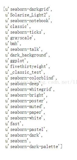
plt.style.use() function; you can set the overall style of the picture. You can know how many themes there are in plt.style.availabel.
import matplotlib.pyplot as plt
import numpy as np
import pandas as pd
import matplotlib as mpl
print plt.style.availabel
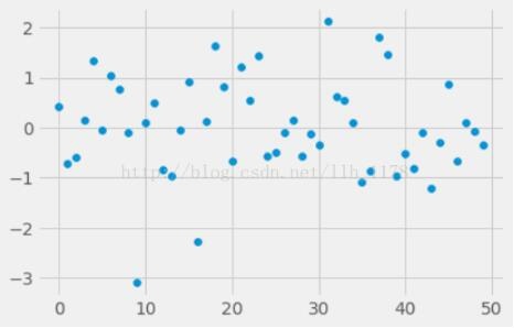
We tried two of these themes.
plt.style.use("fivethirtyeight")
data = np.random.randn(50)
plt.scatter(range(50), data)
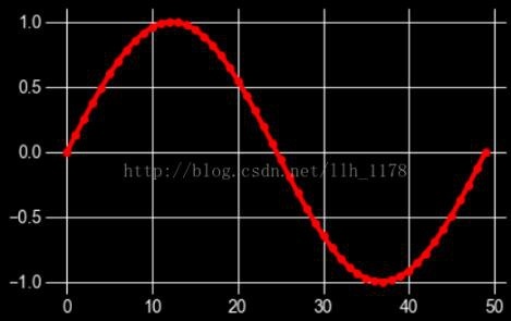
with plt.style.context(('dark_background')):
 plt.plot(np.sin(np.linspace(0,2* np.pi)),'r-o') # "r-o"It means that the red dots are connected by a line.
plt.show()
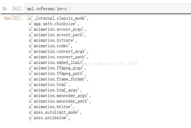
mpl.rcParams() function; this function can set the image axis and the font size, color, width, etc. of the title. At the same time, you can also use mpl.rcParams.keys() to see what settings are there.
mpl.rcParams['xtick.labelsize']=16
mpl.rcParams["ytick.color"]='b'
plt.plot(range(50), data,'g^')
plt.show()
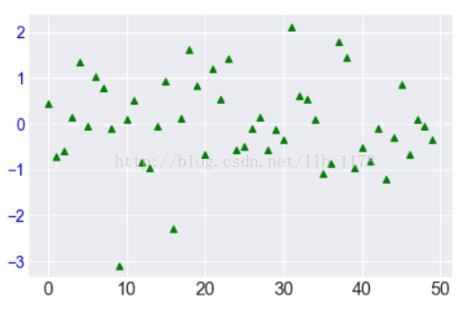
In this picture, the y-axis font color and the x-axis font size are set through the rcParams() function. At the same time, the marker of the point becomes a triangle and the color becomes green.
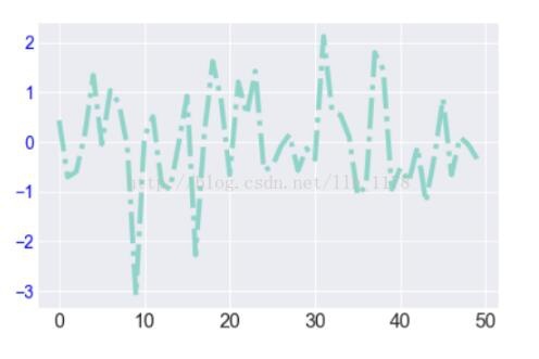
mpl.rc() function; it can be used to set line thickness, style, color, etc.
mpl.rc(‘lines’, linewidth=4, color=’r’, linestyle=’-.’)
plt.plot(data)
The fontdict() function; you can also do the same thing.
font ={'family':'monospace','weight':'bold','size':'larger','color':"r"}
plt.scatter(range(50), data)
plt.xlabel("number", fontdict=font)
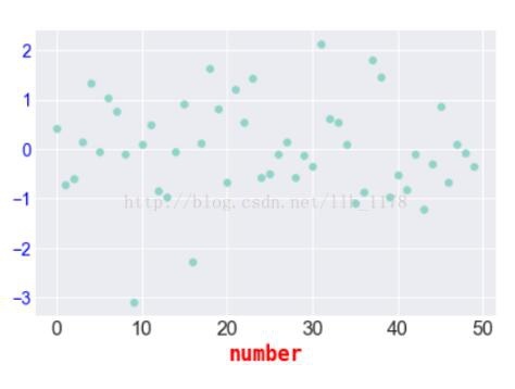
There are several types of keys in the font() dictionary:
font.family; there are 5 settings: serif sans-serif cursive antasy monospace
font.style; one has 3 settings: normal italic oblique
font.variant; There are 2 settings: normal or small-caps
font.weight; there are 4 settings: normal, bold, bolder, lighter
font.stretch; There are 13 settings:
ultra-condensed, extra-condensed, condensed, semi-condensed, normal, semi-expanded, expanded, extra-expanded, ultra-expanded, wider, and narrower. font.size; default value is 10pt
plt.setp() function; you can also set the thickness and color of the line, as well as the direction and position of the coordinate axis.
E.g:
setp(lines, ‘linewidth’, 2, ‘color’, ‘r’)
To borrow an example from the help document:
import numpy as np
import matplotlib.pyplot as plt
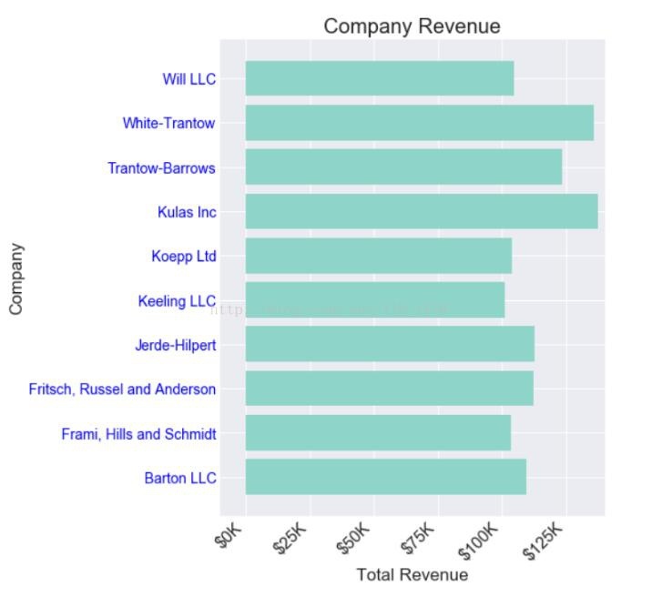
data ={'Barton LLC':109438.50,'Frami, Hills and Schmidt':103569.59,'Fritsch, Russel and Anderson':112214.71,'Jerde-Hilpert':112591.43,'Keeling LLC':100934.30,'Koepp Ltd':103660.54,'Kulas Inc':137351.96,'Trantow-Barrows':123381.38,'White-Trantow':135841.99,'Will LLC':104437.60}
group_data =list(data.values())
group_names =list(data.keys())
group_mean = np.mean(group_data)
fig, ax = plt.subplots()
ax.barh(group_names, group_data)
labels = ax.get_xticklabels()
plt.setp(labels, rotation=45, horizontalalignment='right')
ax.set(xlim=[-10000,140000], xlabel='Total Revenue', ylabel='Company',
title='Company Revenue')
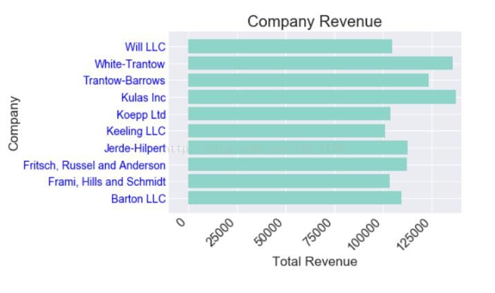
You can see that the x-axis coordinate is rotated obliquely by 45°, and the whole picture becomes more beautiful. In order to analyze the data further, do the following:
def currency(x, pos):"""The two args are the value and tick position"""if x  =1e6:
 s ='${:1.1f}M'.format(x*1e-6)else:
 s ='${:1.0f}K'.format(x*1e-3)return s
formatter =FuncFormatter(currency)
fig, ax = plt.subplots(figsize=(6,8))
ax.barh(group_names, group_data)
labels = ax.get_xticklabels()
plt.setp(labels, rotation=45, horizontalalignment='right')

ax.set(xlim=[-10000,140000], xlabel='Total Revenue', ylabel='Company',
 title='Company Revenue')
ax.xaxis.set_major_formatter(formatter)

fig, ax = plt.subplots(figsize=(8,8))
ax.barh(group_names, group_data)
labels = ax.get_xticklabels()
plt.setp(labels, rotation=45, horizontalalignment='right')

# Draw a vertical line based on the average of all earnings to see which companies exceed the average earnings
ax.axvline(group_mean, ls='--', color='r')

# Mark the newly established company
for group in[3,5,8]:
 ax.text(145000, group,"New Company", fontsize=10,
  verticalalignment="center")

# Move the title a little bit, keeping a little distance from the picture.
ax.title.set(y=1.05)
ax.set(xlim=[-10000,140000], xlabel='Total Revenue', ylabel='Company',
 title='Company Revenue')
ax.xaxis.set_major_formatter(formatter)
ax.set_xticks([0,25e3,50e3,75e3,100e3,125e3])
plt.show()
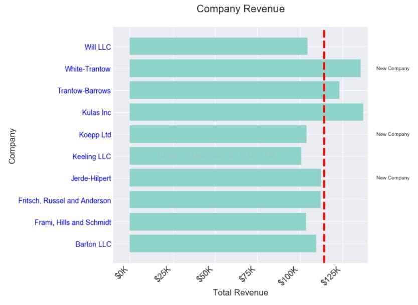
Now it’s good, you can intuitively see which companies are newly established, and which companies’ income is above average. It is very helpful for subsequent data analysis and statistics.
The above general setting method of python drawing is all the content shared by the editor. I hope to give you a reference.
Recommended Posts