Python draw bar graph (bar graph) example
A bar chart, also known as a histogram, is a statistical chart with the length of a rectangle as a variable. The length of the rectangle is proportional to the value of the variable corresponding to it.
1. Vertical bar graph
To draw a bar graph, use the bar function in pyplot. The basic syntax of the function is:
bar(x, height, [width], **kwargs)
| x | Array, the abscissa of each bar |
|---|---|
| height | number or an array, the height of the bar |
| [ width] | Optional parameter, a number or an array, the width of the bar, the default is 0.8 |
| **kwargs | Keyword parameters of variable length, use a dictionary to set other attributes of the bar graph |
**The parameters often set in kwargs include graphic label label, color label color, opacity alpha, etc.
Suppose that the results of a survey on male and female college students' drinking water hobby are as follows:
| Male | female | |
|---|---|---|
| Carbonated drinks | 6 | 9 |
| Green tea | 7 | 4 |
| Mineral water | 6 | 4 |
| Other | 2 | 6 |
| Juice | 1 | 5 |
| Total | 22 | 28 |
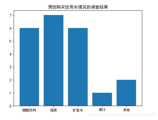
Draw a histogram of the drinking water situation of boys, the code is as follows:
import matplotlib.pyplot as plt

# These two lines of code solve the problem of plt Chinese display
plt.rcParams['font.sans-serif']=['SimHei']
plt.rcParams['axes.unicode_minus']= False

waters =('Carbonated drinks','green tea','mineral water','fruit juice','other')
buy_number =[6,7,6,1,2]

plt.bar(waters, buy_number)
plt.title('Survey results of men buying drinking water')

plt.show()
Graphics:
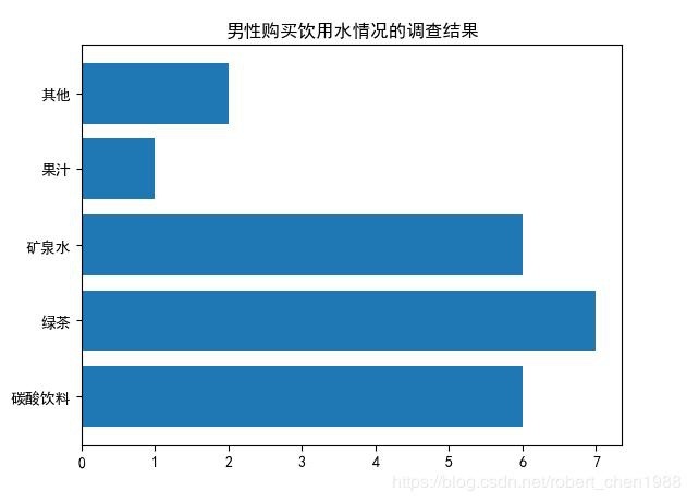
2. Horizontal bar graph
To generate a horizontal bar graph, you can use the barh function, whose syntax is very similar to the bar function.
bar(x, width, [height], **kwargs)
| y | Array, the ordinate of each bar |
|---|---|
| width | A number or an array, the width of the bar |
| [ height] | Optional parameter, a number or an array, the height of the bar, the default is 0.8 |
| **kwargs | Keyword parameters of variable length, use a dictionary to set other attributes of the bar graph |
Code:
import matplotlib.pyplot as plt

# These two lines of code solve the problem of plt Chinese display
plt.rcParams['font.sans-serif']=['SimHei']
plt.rcParams['axes.unicode_minus']= False

waters =('Carbonated drinks','green tea','mineral water','fruit juice','other')
buy_number =[6,7,6,1,2]

plt.barh(waters, buy_number) #Horizontal bar chart function barh
plt.title('Survey results of men buying drinking water')

plt.show()
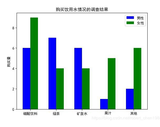
3. Side by side bar chart
If you want to draw two bar graphs for the surveys of boys and girls, you can use the bar or barh function twice, and adjust the bar graph position coordinates and corresponding scales of the bar or barh function to make two sets of bars Figures can be displayed side by side.
import matplotlib.pyplot as plt
import numpy as np

# These two lines of code solve the problem of plt Chinese display
plt.rcParams['font.sans-serif']=['SimHei']
plt.rcParams['axes.unicode_minus']= False

# Enter statistics
waters =('Carbonated drinks','green tea','mineral water','fruit juice','other')
buy_number_male =[6,7,6,1,2]
buy_number_female =[9,4,4,5,6]

bar_width =0.3 #Bar width
index_male = np.arange(len(waters)) #The abscissa of the male bar graph
index_female = index_male + bar_width #The abscissa of the girl bar graph

# Use the bar function twice to draw two sets of bar graphs
plt.bar(index_male, height=buy_number_male, width=bar_width, color='b', label='male')
plt.bar(index_female, height=buy_number_female, width=bar_width, color='g', label='female')

plt.legend() #Show legend
plt.xticks(index_male + bar_width/2, waters) #Let the horizontal axis scale show the drinking water in waters, index_male + bar_width/2 is the position of the horizontal axis scale
plt.ylabel('purchase amount') #Ordinate axis title
plt.title('Survey results of drinking water purchase') #Graphic title

plt.show()
Supplementary knowledge: Python bar graph and histogram are very different
the difference:
First of all, the bar graph uses the length of the bar to indicate the frequency of each category, and its width (indicating category) is fixed;
The histogram uses the area to indicate the frequency of each group, the height of the rectangle indicates the frequency or frequency of each group, and the width indicates the group distance of each group, so its height and width are both meaningful.
Secondly, due to the continuity of grouped data, the rectangles of the histogram are usually arranged continuously, while the bar graphs are arranged separately.
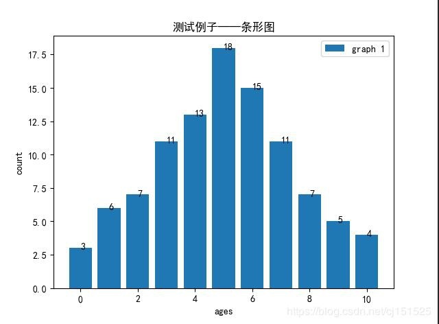
Finally, the bar chart is mainly used to display categorical data, while the histogram is mainly used to display data-type data. What we learned in junior high was the bar chart. Obviously, did you feel that way? (Height-age bar graph) Draw the frequency corresponding to each age on the coordinates. This is what we like most when studying data distribution. If it is still a bit confusing, compare these two images with the same data below and you will understand!
data:
| Age | 0 | 1 | 2 | 3 | 4 | 5 | 6 | 7 | 8 | 9 | 10 | Total |
|---|---|---|---|---|---|---|---|---|---|---|---|---|
| Number of people | 3 | 6 | 7 | 11 | 13 | 18 | 15 | 11 | 7 | 5 | 4 | 100 |
Bar chart (pay attention to the number of each category):

import matplotlib.pyplot as plt
import numpy as np
import pandas as pd
plt.rcParams['font.sans-serif']=['SimHei'] #Display Chinese normally
plt.rcParams['axes.unicode_minus']=False #Normal display of negative sign

# d=pd.read_excel('E:\Python\projects\data\data100.xlsx',header=None)
# d=d[0]
# d=list(d)

ages=range(11)
count=[3,6,7,11,13,18,15,11,7,5,4]
plt.bar(ages,count, label='graph 1')
# params
# x:Bar graph x axis
# y: the height of the bar graph
# width: The width of the bar graph is 0 by default.8
# bottom: The y coordinate value of the bottom of the bar is 0 by default
# align:center /Whether the edge bar graph uses the x-axis coordinate as the center point or the x-axis coordinate as the edge
plt.legend()
plt.xlabel('ages')
plt.ylabel('count')
plt.title(u'Test example-bar graph')for i inrange(11):
 plt.text(i,count[i]+0.1,"%s"%count[i],va='center')

plt.show()
**Histogram: **
import matplotlib.pyplot as plt
import matplotlib.mlab as mlab
import numpy as np
import pandas as pd
plt.rcParams['font.sans-serif']=['SimHei'] #Display Chinese normally
plt.rcParams['axes.unicode_minus']=False #Normal display of negative sign
# d=np.random.normal(0,1,100)
d=pd.read_excel('E:\Python\projects\data\data100.xlsx',header=None)
d=d[0]
d=list(d)print(d)
n, bins, patches = plt.hist(x=d, bins=11, color='#0504aa',
  alpha=0.8, rwidth=0.6) #alpha is the color depth rwidth bar width, the number of bins bars

plt.grid(axis='y', alpha=0.4) #alpha grid color depth
plt.xlabel('age')
plt.ylabel('count')
plt.title('100 samples are distributed as follows')
plt.text(20,40, r'$\mu=0, sigma=1$')#The front is the coordinates, write
# plt.ylim(19) #Set the range of y

plt.show()
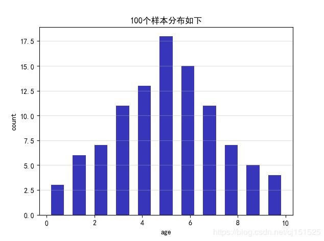
Comparing the two graphs, you can know that the bar graph has the right category, but the histogram uses the interval to divide each bar. Although the difference is roughly the same, the impact on the data research can be large or small. In short, understanding the difference can avoid unnecessary mistakes.
The above example of drawing a bar graph (bar graph) in python is all the content shared by the editor. I hope to give you a reference.
Recommended Posts